New Belgium Brewery Rebrand
February 9, 2014
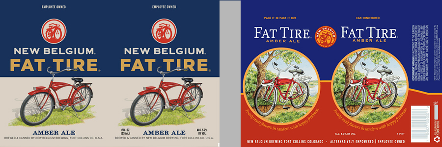
I always look at package design and even more so when it comes to beer labels. As a designer and a huge beer nut, I have definitely enjoyed a few New Belgium beers. For the most part, I would consider myself a fan of the brewery. One thing is for sure, I have always loved the iconic look of their packaging design. The distinctive label of their flagship beer, was a 20-year-old hand painted design, create by the founders’ neighbor. This really made the brand unique, very recognizable, and…. “iconic.”
I don’t dislike the new branding; in fact I think it’s some amazing work. I mean it’s very well done package design work. I’m sure they spent a small fortune on the rebrand. Perhaps it’s the fact that it strangely resembles vintage advertising from the 50’s, with a weird contemporary approach. It does add some continuity that the old branding lacked. Who knows, maybe it will grow on me?
I wonder if the design strategy is geared for a mass-market appeal? The new labels started hitting the shelves in January 2014.
comments powered by DisqusSocial Media
Copyright ® Schmoll Creative, LLC / All rights reserved.